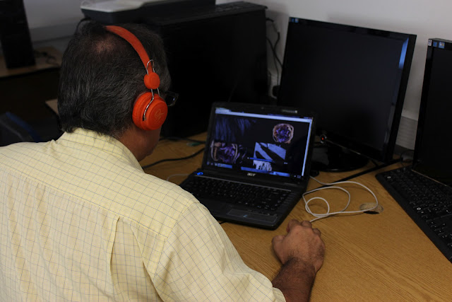
Today I conducted my first case studies at the college. These can be found in my Manifesto and Process Page. Below are some of my first observations, based on my Beta-version of the application.
Case study results:
1st look general comments:
"This is quite addictive"
"It feels like a puzzle"
"the creepy sound makes you think that something bad is going to happen to the little girl"
2nd test observation:
Participant 1 (mature Photography student):
The participant was not told what to do and was not told what the application was about. The first observation was that he simply looked at the visuals without pressing anything. He commented that he felt absorbed into the water colours.
He commented that the sound effects coming from the water colour made him feel like he's in space. He even said that he saw faces in the moving water colours. With regards to concept he said that the subject seemed to be about different aspects of life / identity and personalities.
He was slightly confused by the moving and dragging and found the jamming of the videos to be slightly annoying. Finally he said that he wished to be able to go back to certain videos to hear all the stories and that he wanted to see and hear everything all at once.
Was playing with the application for more than 15 minutes and only stopped when I told him to explain what he thought was happening.
"To me it seems like it's saying, whilst something is going on in my life, something is also going on in yours."
Participant 2 (Photography student):
The participant found the application very confusing. Almost immediately she started to try and organise the videos. The constant randomisation seemed to frustrate her. She commented on how the sound stopped half way through the video (she did not know that the videos in fact had no sound and the sound recordings were randomised).
She seemed to want to find a certain closure and to order the chaotic environment. Subsequently she was quite annoyed with the application. She did find the stories interesting and funny. She also thought that the water colours were filmed floating 3d structures.
Participant 3 (Photography student):
Found the application to be "disjointed". She tried to figure out if the sound and visuals are connected / synched. Correctly guessed that some videos had corresponding recordings, whilst other didn't (since the application is still unfinished). She felt that the stories were about life and traumatic events that have caused some kind of impact on the individual. She stopped the sound attached to the water colour to be able to listen to the story.
Participant 4 (Media Lecturer & Producer):
The participant was trying to listen carefully to the story and seemed to have figured out the pattern quickly. He stopped clicking after a while, seemingly scared to lose the story. He states that he feels that the concept can work (he was not told what the concept was) but that the execution was "one big mess". He did not want the stories and videos to stop when others were clicked. He stated that nothing made sense and that he would have liked more control; buttons to choose and control sounds and effects.
When asked what he thought the concept was about, he said that he thought that I was trying to create sounds that put one in a certain state of mind. He didn't get the water colours but said he understood the link when he saw the one with sounds effects.
Participant 5 (Fine Art Assistant Lecturer):
This one was quite interesting to observe and she played around with the application for quite some time. She listened to the first recordings until the end without clicking anything; she seemed to be quite immersed in the story. (Does the sound distract from the visual?) Most people seemed to be scared to click through in the beginning and in fact did not get to see most of the stories.
When the story ended and she played another visual, a few things changed in the interface and her curiosity seemed to arise. (Participants immediately assumed that the recordings were attached to the visuals.)
The participant stated that the top-right screen was more appealing (although this was changing randomly). She found the scrolling to be distracting (this will hopefully be eliminated). She found the various accents to be creepy and made her feel slightly uncomfortable. She said that she first tries to focus on the sound to figure out what was going on, but once she realised that the stories were not so dramatic she started to focus on the visuals. "First it makes sense, then you're confused, but then it clicks". She also thought that the water colours were warped videos.


No comments:
Post a Comment